
5 min read
Dental Website Booking Button: 5 Best Placements for Growth
Stop losing patients to the clinic down the street. Learn the five high visibility locations for your dental website booking button to boost conversions.
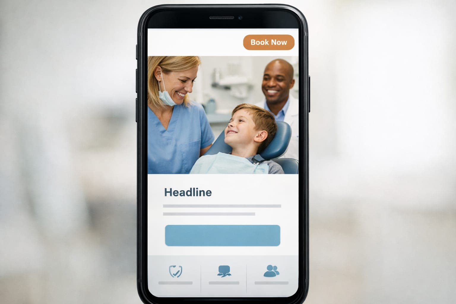
Your dental website booking button is the most important element for turning a casual visitor into a scheduled patient. If this button is hard to find or difficult to click on a mobile device, you are losing potential revenue to the clinic down the street. Strategic placement ensures that patients can book their appointments in a few taps without friction.
Key takeaways
- Place booking buttons above the fold for immediate visibility.
- Use high contrast colors and a minimum size of 48x48 pixels for mobile users.
- Integrate contextual booking options within service pages and blog posts.
- Implement a sticky header and footer to maintain a constant path to conversion.
Where should I put my booking button for the most leads?
Stop making your patients hunt for a way to contact you. Every single second a visitor spends searching for a "Contact" page is a second they spend considering your competitor. You need to place your calls to action exactly where the eye naturally lands.
The Header (Top Right Corner)
Most visitors instinctively look at the top right of a screen for the primary action. Place a high contrast button here with clear text like "Book Now" or "Schedule Online."
For desktop users, implement a sticky header. This means the navigation bar stays locked at the top of the screen as the patient scrolls down through your testimonials or service lists. By keeping the dental website booking button visible at all times, you remove the need for the user to scroll back to the top when they finally decide to commit.
The Hero Section (Above the Fold)
The first thing a visitor sees on your homepage must be a direct path to an appointment. This area is your digital storefront. If it is cluttered or vague, patients will bounce.
Pair a bold, patient centric headline, such as "Get the Smile You've Always Wanted," with a prominent button directly underneath. Avoid vague language like "Get Started" and use direct phrases like "Schedule Your Appointment." This is a critical part of the clinic website first impression that determines if a patient stays or leaves.
How do I increase my conversion rate on service pages?
When a patient reads about a specific treatment, they are often in the decision making phase. They are no longer just browsing; they are looking for a solution to a specific problem, such as a chipped tooth or gum disease. This is the perfect time to prompt them to take action.
Treatment Detail Pages
Whether a patient is researching implants or whitening, place the booking button right next to the treatment steps or pricing. Do not force them to navigate back to the home page to find the scheduler.
After explaining the benefits of the procedure and addressing common fears, add a simple call to action such as "Ready to transform your smile? Book now." By placing the button at the bottom of the treatment description, you capture the patient at the peak of their interest.
Contextual Blog Links
If you provide dental care tips through your blog, give readers a way to act on that advice immediately. Educational content builds trust, and trust leads to bookings.
A post about preventing cavities should end with a direct link to "Book your next cleaning now." A guide on the benefits of Invisalign should have a button that says "Check if Invisalign is right for you." This turns your educational content into a tool for patient acquisition rather than just a reading exercise.
Optimizing for mobile patient acquisition
A large percentage of your patients will visit your site from a smartphone while on the go. They might be searching for a dentist during a lunch break or while commuting. If the mobile experience is clunky, your conversion rate will drop instantly.
The Sticky Footer
A sticky footer keeps the booking option on the screen regardless of how far the user scrolls. This is a non negotiable for modern dental sites. Use a persistent bar at the bottom of the mobile view with a "Tap to Book" button and a phone icon for quick calls.
This approach ensures that the path to conversion is always one thumb tap away. GenXTech Solutions focuses on this type of conversion centered design to reduce abandoned visits and streamline the user journey.
Mobile Technical Standards
To ensure a smooth experience, follow these technical guidelines:
- Size: Keep buttons at least 48x48 pixels to prevent accidental misclicks.
- Contrast: Use bright colors, such as blue or green, against neutral backgrounds.
- Whitespace: Leave ample room around the button so it is easy to hit without clicking other links.
- Speed: Ensure the booking page loads in under 2 seconds to prevent bounce rates.
- Thumb Zone: Place the most important buttons within the natural reach of a user's thumb.
Why button text and psychology matter
The words you use on your dental website booking button can change your conversion rate by several percentage points. You want to move away from clinical or demanding language and move toward benefit driven language.
Action Oriented Language
Instead of "Submit" or "Contact Us," use phrases that imply a result. "Claim Your New Smile" or "Secure Your Appointment" creates a sense of ownership and urgency.
Reducing Anxiety
Dental visits cause anxiety for many people. You can lower the barrier to entry by using softer language on your buttons for initial consultations. Try "Request a Free Consultation" or "Check Availability." This feels like a lower commitment than "Book Appointment," making the patient more likely to click.
Comparing booking button strategies
Choosing the right approach depends on your specific goals for dental marketing and the type of patients you want to attract.
- Static Header: Best for general brand awareness and easy navigation.
- Hero Button: Best for immediate conversion of new visitors who are ready to buy.
- Contextual Buttons: Best for high intent patients looking for specific, high value treatments.
- Sticky Mobile Bar: Best for maximizing mobile conversion rates and reducing friction.
For those managing multiple high ticket services, you might find that single treatment landing pages perform better than a general services list. These pages allow you to tailor the booking button text specifically to the treatment, which usually results in higher quality leads.
Common mistakes that kill conversions
Many clinic owners make the mistake of thinking more buttons equals more bookings. This is not true. Too many competing calls to action can lead to decision paralysis.
- Overcrowding the Header: Do not put three different buttons in your menu. Pick one primary action (Booking) and make it the most visible.
- Poor Color Choice: If your button is the same color as your brand's background, it disappears. It must pop.
- Broken Links: Nothing kills trust faster than a "Book Now" button that leads to a 404 error or a broken form.
- Hidden Forms: If your booking button leads to a form with 15 required fields, patients will quit. Keep the initial booking process short.
Next step
Audit your current site to see if your booking options are buried or difficult to use on mobile. While a self audit is a start, a professional review uses heatmapping tools to see exactly where patients are clicking and where they are getting stuck. Contact us for a professional website review and conversion audit.
Frequently asked questions
What is the best color for a dental booking button?
Use high contrast colors that align with your brand's primary accent color for consistency, but ensure they stand out against the background. Bright blue or green often work well. Avoid red, as it can feel too urgent or negative in a healthcare context.
Should I use the same text on every booking button?
While the goal is the same, you should tailor the language to the page. Use "Schedule Now" on the homepage and "Book This Treatment" on specific service pages to maintain relevance.
How often should I test my button placement?
You should review your conversion data every 6 months or after any major website update. A/B testing different colors or positions can help you find what your patients prefer.
Does the size of the button actually matter for conversions?
Yes, especially on mobile devices. Buttons smaller than 48x48 pixels are difficult to tap, which leads to user frustration and abandoned bookings.
Should the booking button open a new tab?
Generally, it is better to keep the user in the same window to maintain a smooth flow. Ensure the booking software is mobile responsive so the transition is smooth.